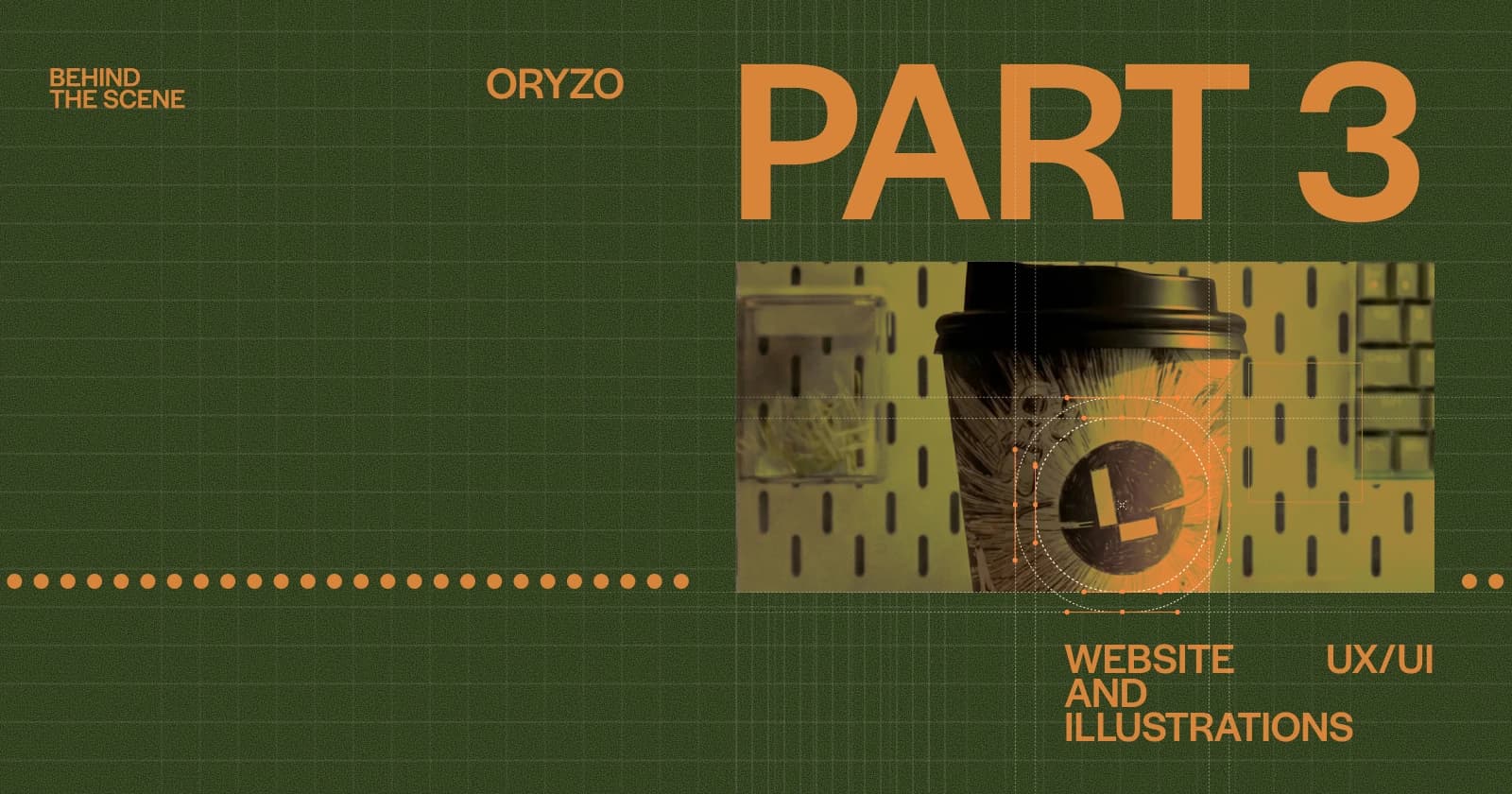
Oryzo BTS (Part 3 / 7) - Website UX/UI and Illustrations
If you have not seen Oryzo AI in action yet, I would recommend checking it out first: oryzo.ai. It is, quite honestly, five minutes of your life gloriously wasted for a nerdy laugh.
This is the third post in the Oryzo behind the scenes series. Part 1 covered how the idea came together. Part 2 covered how the visual world was built. This one is about the design system, the illustrations, and the way we approached both.
We will walk through the early visual exploration, the design principles that came out of it, the way we kept UI from getting in the way of the content, and where we allowed AI into the pipeline without letting it define the final look.
Finding the Look
Once the idea was locked in, as covered in Part 1, we had to figure out what the site should actually look like. We all have to start somewhere:

A completely different style, right?
It looked like one of those typical Awwwards Site of the Day concepts from a design studio portfolio. Clean, stylish, and abstracted. But something was missing. It felt lifeless.
That direction treated the coaster more like an abstract product study. It looked good, but it stripped away the world around it. We wanted the opposite. We were happy to give up some minimalism if it meant placing the product inside a more believable environment.
That was the moment the desk came in.
The hero scene became a creative work desk, the kind of space that feels lived in by someone in a studio. That direction lined up naturally with two things Lusion already does well: storytelling, and realistic real time 3D in the browser.

At this stage, we were also using Midjourney to explore composition and mood. The hero scene started to find its identity, and once the direction was approved internally, the work moved into full non-AI 3D production, which we covered in Part 2.

At that point, the site structure itself was still fairly standard: hero shot, key benefit, usage, specs, reviews, comparisons, purchase. Nothing unusual. What this second concept really gave us was not a radically different layout, but a clearer set of principles to build against.
There were four of them, and they guided almost every design decision that followed:
A realistic image.
The product at the centre.
Seamless transitions.
Humour.
From there, the next question was how to translate those ideas into typography, colour, and UI.
Design Without Ego
Working at Lusion means working as part of a creative collective. Working on Oryzo meant working inside something closer to an orchestra, where each person plays a specific role.
This project already had a lot going on: 3D renders, humour, photography, dense product copy, little visual jokes, and a world full of props. In that kind of environment, design cannot constantly ask for attention. Its job is to support the content, not compete with it.
So we made two early decisions: use as few typefaces as possible, and use as few colours as possible.
Around 99 percent of the type on the site is set in a single family. The colour system is just four values: a cream, a near black, a muted olive, and an orange. Anything more expressive than that would have started pulling attention away from the renders and illustrations, which were already doing the heavier visual work.
We also stripped back the type system itself. SUB 3, LINK FOOTER, BTN 2, BIG QUOTE, and INPUT TEXT all disappeared from the original set. The rule was simple: typography should hold the layout together, then step out of the way.

Does that make the design process easier? Not really. Constraints like these usually create more pressure, not less. But they also force better decisions.
On the hero section, for example, the text is doing more than delivering information. It is also helping to reinforce the feeling that this is a real desk with real objects on it. The typography behaves almost like another prop in the scene.

There were also a few moments where we deliberately broke our own rules. The transition between sections, for example, leans into the visual language of an old fashion magazine and uses a completely different set of typefaces. It is one of the few places on the site where the UI is allowed to perform, because the surrounding scene is asking for exactly that kind of flourish.

Using AI With a Straight Face
This part is a little delicate.
Oryzo pokes fun at AI and the way it gets used, while at the same time AI tools were part of our own pipeline. Earlier in this post, you already saw composition studies made with Midjourney. Beyond those early stages, we also used Google Flow in a few very specific ways.
The important distinction is this: AI was not generating the core idea or the final look. It was helping us quickly test combinations of things we already had.
In other words, the source material was ours. The result was a rough visual check, not a finished asset.
That distinction might sound small, but to us it matters. It is the difference between using AI to speed up a decision and using it to replace one.
An office mug combined with a photo from an Nvidia press kit:

A scene render paired with an illustration:

Some of these ended up as final assets on the site. They were fast visual tests, often done in about an hour, just to answer a simple question: does this read, or does it not?
If the answer was yes, the direction moved into real production. If the answer was no, we dropped it and moved on.
We wanted to use AI exactly as much as it deserved to be used in a project like this, and not a step more.
A Human Layer
To balance out all the premium tech language and digital polish, we wanted a layer that felt more obviously handmade.
That led us to illustration.
None of the illustrations on the site were AI assisted. Everything was drawn by hand in Procreate. We only wanted AI in places where it reinforced the joke or helped us test a direction. The illustration layer needed to do the opposite. It needed to bring taste, irregularity, and human intent back into the system.
We created a series of custom drawings inspired by technical sketches, with a few nods to Leonardo da Vinci style anatomical studies. It made the whole project feel slightly overcommitted in a way we really enjoyed.

If you look closely across the site, you will notice small hand drawn elements tucked into different scenes. They act as little reminders that even in a very tech forward project, a lot of what we care about still comes back to human output, taste, and the process of making things carefully.
For the coffee mug on the desk, we drew a custom illustration inspired by Lusion’s website astronaut character. Instead of treating it like a separate graphic, we painted it directly onto the surface of the mug so it would hold up properly inside the 3D world.
A small detail, but an important one. It makes the object feel like it belongs to the scene, rather than sitting on top of it.

Further down the page, in the close up section where Oryzo is pushed to an absurd level of zoom, there is another small layer of detail. If you stay there long enough, tiny characters begin to appear.
Those are tardigrades.
They are not especially cute, which made them even more fun to include. Turning a technical scale reference into something slightly ridiculous landed exactly where we wanted it to, somewhere between overdesigned and completely justified.
Like most things in this project.

Tools
We try not to be too precious about tools, but for the sake of record, here is what went into this part of the project:
Figma for layouts and the UI system.
Rive for interactive animations and motion prototypes.
Midjourney for early concept and composition exploration.
Google Flow for image generation for the AI jokes on top of our own 3D renders.
Procreate for illustrations.
Closing Thoughts
Most of the UX work on Oryzo came down to deciding what not to do.
Fewer typefaces. Fewer colours. Fewer UI ideas competing for attention. Fewer fully generated assets.
The parts of the site that do get loud, the desk scene, the humour, the illustrations, only work because everything around them stays relatively quiet.
In Part 4, we will move from design into the WebGL and Three.js layer, and start breaking down some of the technical tricks that made all of this run in the browser.
Oryzo Behind the Scenes Series
We will be publishing the rest of the Oryzo behind the scenes series over the next few days. If you enjoyed this post, feel free to bookmark it or subscribe for the upcoming parts.
☑ Oryzo BTS (Part 3 / 7), Website UX/UI and Illustrations
☐ Oryzo BTS (Part 4 / 7), WebGL/ThreeJS Tricks 1
☐ Oryzo BTS (Part 5 / 7), WebGL/ThreeJS Tricks 2
☐ Oryzo BTS (Part 6 / 7), WebGL/ThreeJS Tricks 3
☐ Oryzo BTS (Part 7 / 7), WebGL/ThreeJS Tricks 4