Oryzo BTS (Part 2 / 7) - 3D Design and Motion Graphics
If you have not seen Oryzo AI in action yet, I would recommend checking it out first - oryzo.ai. It is, quite honestly, five minutes of your life gloriously wasted for a nerdy laugh.
If Part 1 was about concept and creative direction, this is where the visual world started to take shape. In addition to the main website scenes, we also developed a full set of campaign assets, including a prelaunch video, a launch film, and a range of behind the scenes content. So this post is naturally a more visual one, full of 3D experiments, motion studies, and production tests.

At Lusion, we care more about the final experience than any particular tool. The pipeline follows the idea, not the other way around. That principle has led us to use a wide mix of software depending on what each project actually needs.
For Oryzo, which relied heavily on 3D imagery and motion, we primarily used SideFX Houdini for scene building and Maxon Redshift for rendering. Houdini, while traditionally associated with visual effects in the Hollywood movies, has become a core part of our workflow for building flexible systems that translate well into interactive web work. Redshift, being GPU accelerated, gave us the speed we needed to iterate quickly on lighting, textures, and final renders.
With that foundation in place, the next step was to define the main visual anchors of the campaign.
The Hero Scene

We needed a setting that could hold the coaster naturally while also helping establish the tone of the project.
A desk felt like the obvious choice.
It became the hero scene of the entire campaign: warm, calm, and filled with objects that would feel familiar to designers and other visually minded people. We wanted to create an environment that felt curated and believable enough to support the absurd seriousness of the product presentation.
We explored several directions before landing on the final look. Here are a few early tests:


In the end, we settled on the work desk because it felt the most personal to us. It reflected the kind of space we know well, somewhere between digital tools and analogue mess, between design work and everyday objects.

One of the biggest technical challenges was preserving the fidelity of that scene once it moved into a web based environment. We tried image sequences and video, but they lacked the interactivity we wanted. We also tested real time PBR rendering, but it did not quite reach the visual quality we were aiming for.
So we explored Gaussian Splatting as a way to translate high quality rendered scenes into something that could still run in real time with WebGL. We tested two tools for this workflow: Jawset’s Postshot (paid) and the open source Lichtfeld Studio (free).
In most of our production tests, Postshot gave us better quality and faster processing times. That said, Lichtfeld Studio has continued to improve and now includes features like LOD support, so it is still very much worth exploring.

To generate the dataset, we rendered multiple camera perspectives in Houdini and processed them through Postshot to create the splats. We also split the scene into multiple splats for compositing inside the web experience, which we will talk about more in later parts.
At first, we made the classic mistake of trying to be too clever.
Because Oryzo.ai is a linear scrolling web experience, we assumed the best dataset would come from rendering the exact camera spline used in the final website. In theory, that sounded efficient. In practice, it reduced the quality of the result. Too many nearly identical frames during eased camera motion meant weaker coverage in the areas that actually needed more variation.
The better solution turned out to be the simpler one: standard hemispherical or spherical camera placement.

Postshot requires both images and COLMAP data. With real world scans, Postshot can estimate this itself, or you can use tools like RealityScan to improve the tracking. But in our case, because the images were rendered in Houdini, the camera data already existed.
That meant we could export it directly.
To streamline that process, we used GSOPs, a third party Houdini toolset for Gaussian splats, which made it much easier to export COLMAP data and move efficiently from Houdini into Postshot.

The scene itself was built through a mix of sourced assets and custom work. Some areas, like the background trays, included many small objects that would have been tedious to place manually. For those, we used rigid body simulations to let the objects settle naturally into place.
That is often how these workflows unfold. Large forms come together quickly, then the smaller details demand much more specific, and sometimes slightly strange, solutions.
One Trick Pony Does Not Work
We tried rendering the entire scene as Gaussian splats:

We pushed it to around 900,000 splats already, but if you look closely at the desk and the cutting mat, you can still see plenty of flaws in the wooden details and the fine sketch lines.
That led us to a hybrid solution.
We used splats only for the props and the desk reflections. Once we narrowed the splat content to the elements that actually benefited from it, the result immediately looked better, even with far fewer points: around 78,233 splats on desktop and 44,683 on mobile.

For the rest of the scene, we fell back to simpler texture mapping. Even there, we used several tricks to preserve visual quality while keeping the overall file size under control.
For the desk and the mat, we simplified the geometry and merged them together. Redshift does not let you directly bake displacement or tessellation detail into a texture map in the way we wanted, so instead of baking, we rendered orthographic passes from the top and front without reflections, then stitched them back together in Photoshop.
Because the camera spends most of its time focused around the centre of the desk, we also added a shader pass to distort the texture coverage so that the centre 50 percent of the surface received roughly 90 percent of the available texture detail.


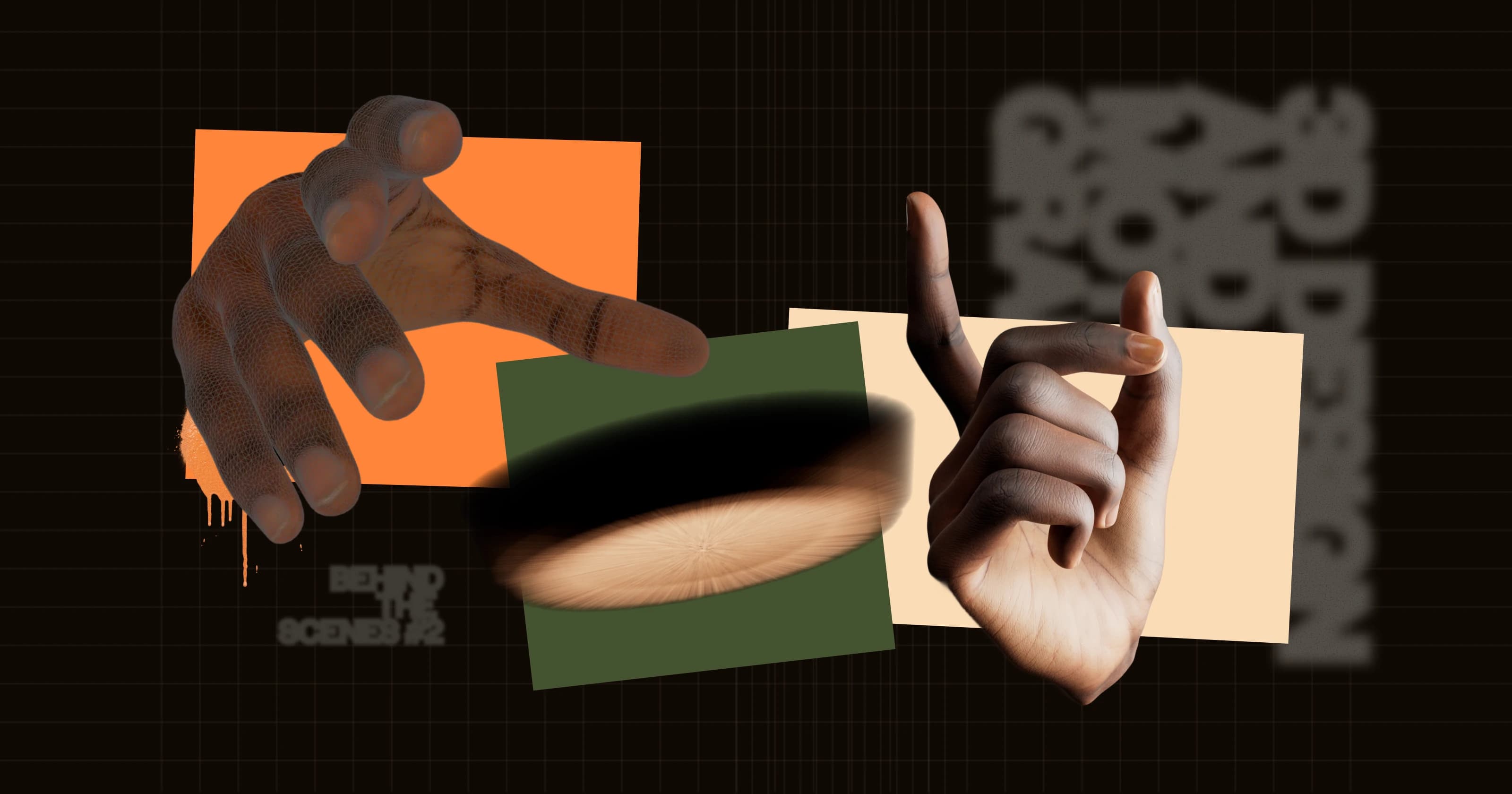
Human Interface

One of the clearest visual references in Oryzo came from the way premium tech campaigns use hands.
That kind of imagery is familiar from product advertising, especially in Apple campaigns, where human interaction is used to make digital objects feel tactile, minimal, and desirable. We wanted to borrow some of that visual language and reinterpret it for our own purposes.
The result was the six finger hand scene.
We started from a high quality 3D scan of a real hand that we purchased from 3D Scan Store, then modified it to give it one extra finger.

We then built a rig in Houdini using KineFX. Even though rigging can become very complex, the motion we needed was fairly contained, so a relatively simple setup was enough to give us the control we wanted.


What mattered most here was not technical complexity for its own sake, but the feeling of physical intent. The hand needed to move with just enough realism to sell the premium presentation, while still leaving room for the joke to land.
Function Reimagined

Once the core visual language was in place, we started looking for ways to stretch the product concept further.
One of those directions was the idea of making the coaster feel “wearable.” Premium products never just sell specifications. They sell lifestyle, identity, and status. Somehow, following that line of thinking led us to the condom wrapper packaging scene.

For the packaging, we used Houdini’s Vellum system to simulate realistic stretching and material behaviour. You could approach this with sculpting or more traditional polygon modelling, but simulation made more sense for us because we already knew the geometry would need to tear later.
That made the process feel closer to a real material study rather than a purely static model.
We used two planes with different physical properties to represent two different materials. The front side was a flimsy transparent plastic with lower stiffness. The back side was a soft metallic layer that was stiffer and more resistant to bending. We then applied attraction forces that behaved like a vacuum seal. To add more realism and wrinkling, the attraction force on the upper layer was multiplied by a noise distorted radial wave pattern, as shown below.

The tearing animation was also driven by Vellum. We split the mesh into separate sections, stitched them back together with weld constraints, and let those constraints break dynamically once they reached their stress limits. By animating the initial separation, the solver handled the rest and produced a tearing motion that felt much more natural than a hand animated effect would have.

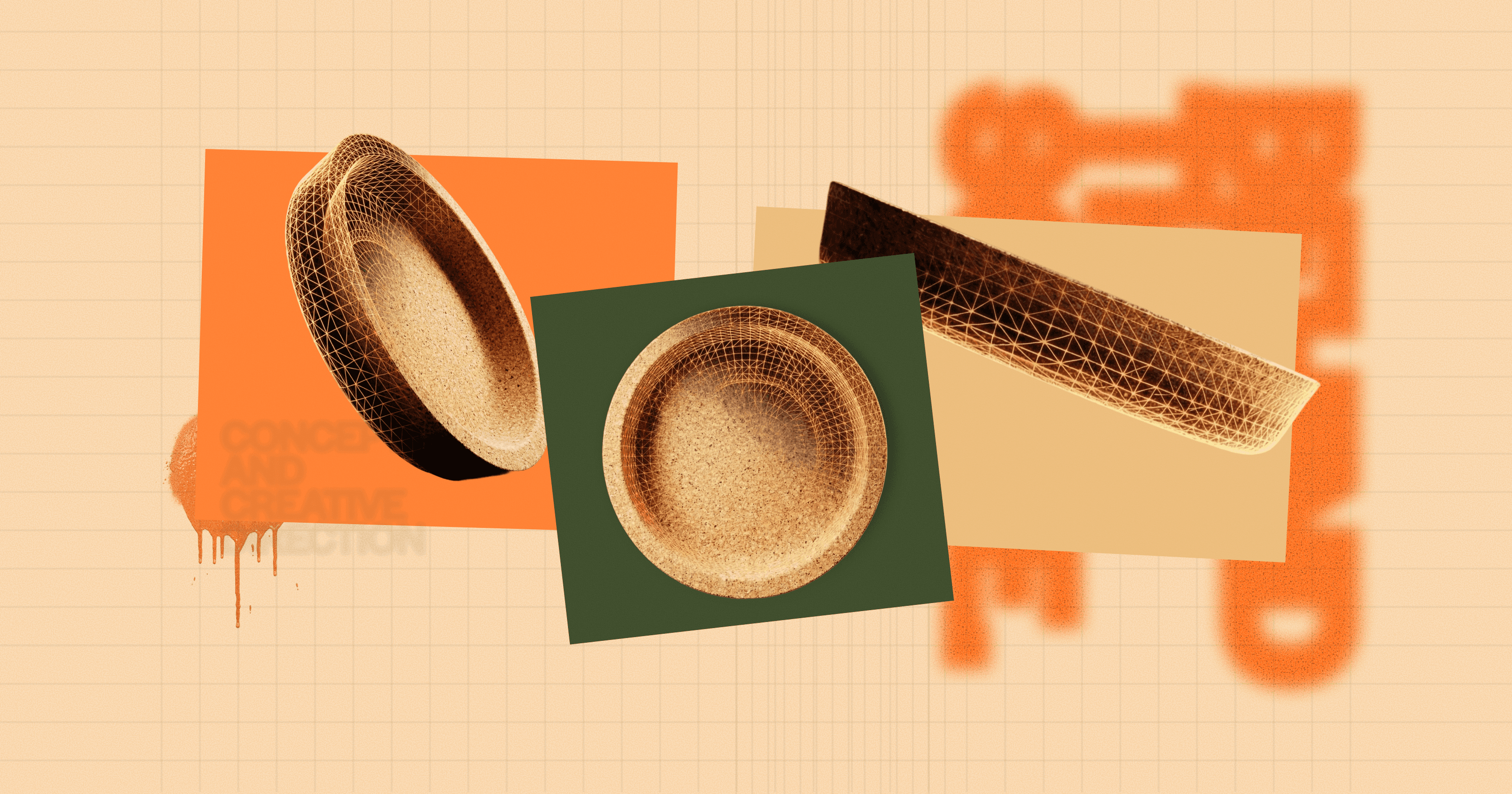
Inside the Material
As part of the storytelling, we wanted to talk about the material qualities of cork at a microscopic level. That led us to create a close up render as the main background, paired with an interactive microscopic view box for a more detailed material reveal.

For the macro render, we first developed an early look development pass that looked something like this:

The cork itself was built using a VDB modelling setup combined with procedural noise to create the right look and feel. It already felt visually convincing, but then we pushed it further by treating it as a microscopic world that also needed to loop seamlessly across the horizontal scroll.
That turned out to be particularly challenging. We had to pay close attention to seam handling and rely on periodic noise so that both the vertex positions and the surface normals would transition cleanly across the loop.

We also added a small Easter egg in this interactive section. If you drag and shake the microscopic view rapidly, a water bear appears.

To create that asset, we experimented with an AI assisted pipeline. We generated multiple reference views using Nano Banana Pro via Google Flow, processed them through Hunyuan’s 3D generator, then refined the result in ZBrush and added procedural detailing before baking it back into textures.

Grounded in the Real
The more we worked on the project, the more important it felt to ground some of the visuals in something physically real.
When we looked more closely at the material, we were reminded that cork comes from the outer bark of cork oak trees. That gives it a strong tactile and ecological identity. Rather than relying entirely on pre made models or purely generated assets, we wanted to bring some of that material truth directly into the campaign.
So we bought a piece of cork bark from Amazon, mounted it on a tripod setup, and photographed it for photogrammetry using a digital camera in RAW.

We captured around 180 high resolution images to give us enough coverage for accurate geometry and texture reconstruction. Those images were then processed in RealityScan to generate the mesh and texture maps.
From there, we refined the result further with subtle procedural surface treatment to improve the richness of the close up renders.
That scanned bark ended up becoming an important visual ingredient not only in the website, but also in the film and promotional assets.


The Film
By the time we moved into the launch film, most of the visual ingredients were already there.
The goal of the film was to distill them into something simple, premium, and cinematic, taking cues from luxury technology product videos without overcomplicating the structure.
We opened with a sequence focused on how cork is traditionally produced, using the same scanned bark asset to anchor the story in something tangible and material.
From there, the film transitions into a more stylised world. The disintegration effect was created using VDB mesh booleans, particle simulations, and pyro smoke, allowing the material to shift from natural object into designed spectacle.
The following sequence uses a textured backdrop generated in Copernicus, Houdini’s GPU accelerated image processing system, inspired in part by Jose Molfino’s experiments translating TouchDesigner style techniques into COPs.
The remaining shots are relatively restrained. They rely less on technical novelty and more on timing, composition, and motion. That was intentional. For a product film like this, the challenge is often not adding more, but knowing when to stop.
And in a way, that idea runs through the whole project.
Even when the product is absurd, the craft still works best when it is controlled.
https://www.youtube.com/watch?v=0PZPwjqYViw
Closing Thoughts
By this stage, Oryzo had already become much more than a single coaster render. It had grown into a full visual system spanning the website, campaign content, and launch film. What made that possible was not any one trick, but the way all of these pieces were shaped to support the same tone.
In Part 3, we will go deeper into the website flow, illustration, and UI design decisions that helped bring that tone into the interactive experience.
Oryzo Behind the Scene Series
We will be publishing the rest of the Oryzo behind the scenes series over the next few days. If you enjoyed this post, feel free to bookmark it or subscribe for the upcoming parts.
☑ Oryzo BTS (Part 1 / 7) - Concept and Creative Direction
☑ Oryzo BTS (Part 2 / 7) - 3D Design and Motion Graphics
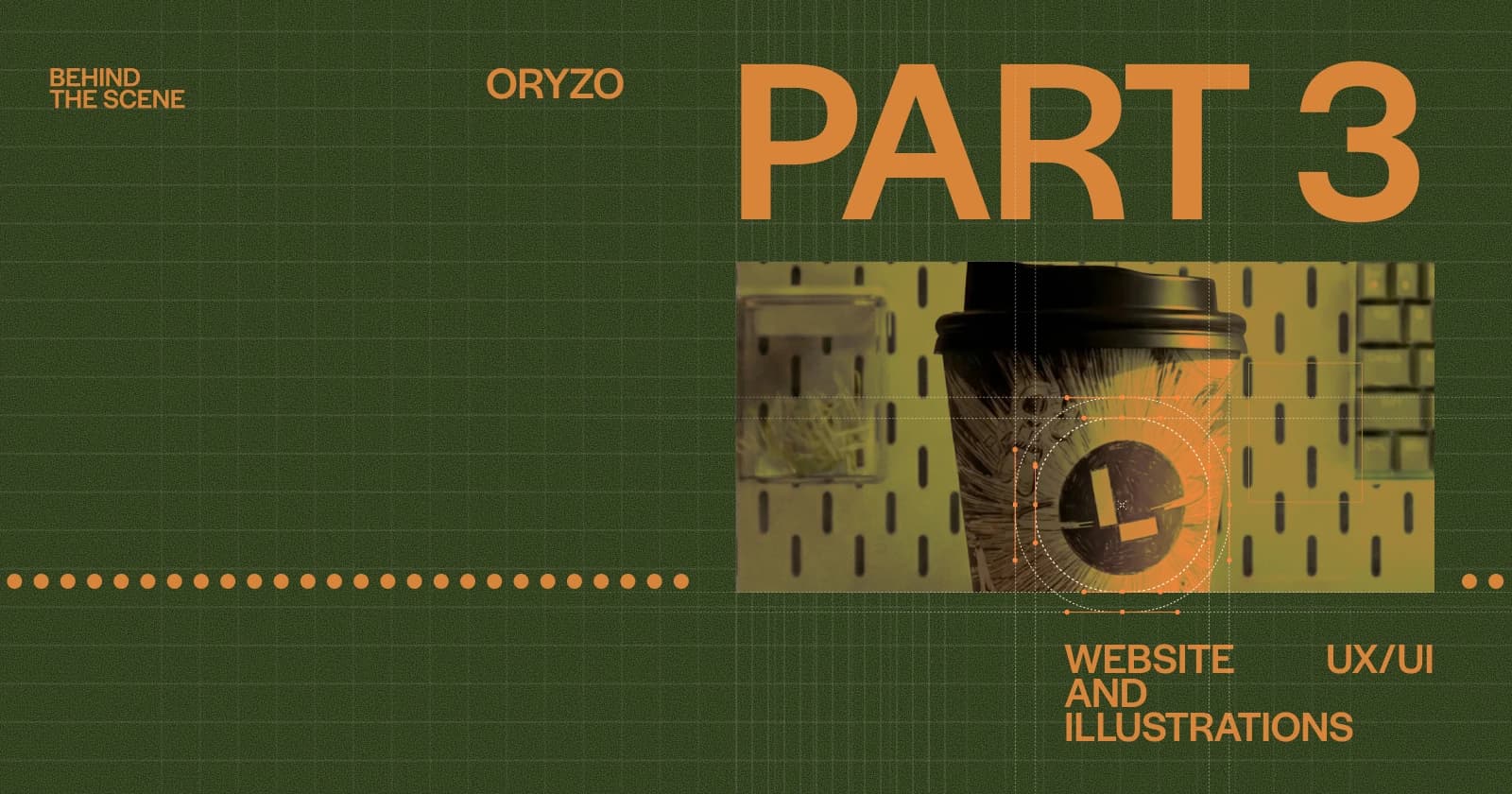
☑ Oryzo BTS (Part 3 / 7) - Website UX/UI and Illustrations
☐ Oryzo BTS (Part 4 / 7) - WebGL/ThreeJS Tricks 1
☐ Oryzo BTS (Part 5 / 7) - WebGL/ThreeJS Tricks 2
☐ Oryzo BTS (Part 6 / 7) - WebGL/ThreeJS Tricks 3
☐ Oryzo BTS (Part 7 / 7) - WebGL/ThreeJS Tricks 4