Oryzo BTS (Part 1 / 7) - Concept and Creative Direction
If you have not seen Oryzo AI in action yet, I would recommend checking it out first - oryzo.ai. It is, quite honestly, five minutes of your life gloriously wasted for a nerdy laugh.
Oryzo is a year long internal project, and we wanted to share some of the thinking behind how it came together. This post is the first in a seven part behind the scenes series on the making of Oryzo.ai. Across the series, we will cover the concept, creative direction, design process, and technical execution behind the project.
We hope you enjoy it and maybe find a few useful ideas in it too.
When the Legend Was Born
Back in early 2025, we had not done a proper Monthly Experiment at Lusion for quite a while.
At Lusion, we have a long standing tradition of setting aside time for internal visual experiments and sharing them online. Some of those ended up on our Lusion Labs page. Those projects were always valuable for us. They gave us room to play, test ideas, and explore directions that client work would not always allow.

After a particularly intense period of client projects, we decided it was time to commit to one bigger internal piece.
If you have followed our work before, you will know that we mostly operate in the advertising space, designing and developing 3D immersive digital experiences for brands and agencies. Over the past few years, though, the industry has been shifting, and we have been gradually trying to move further into brand design and storytelling.
That led us to a simple realization.
Most of our work had been for digital products. We had never created a website for a physical product.
When we looked at websites like Opal Camera and Daylight Computer, it became obvious that this was a space we wanted to explore more seriously. Product storytelling on the web has its own language, its own rhythm, and its own kind of restraint. We felt it could open up a very interesting direction for the studio.
But there was one obvious problem.
We did not actually have a product.
So the first step was to find one.
It could be almost anything, but we knew it could not be something heavily branded. A lot of design experiments rely on borrowing the equity of a famous logo to create instant appeal. You put a Nike logo on something, make it glossy enough, and suddenly it looks more legitimate than it really is. We never liked that approach. It feels more like borrowing attention than earning it.
The product had to be generic enough to prove a point:
If we can sell this, we can help you sell anything.
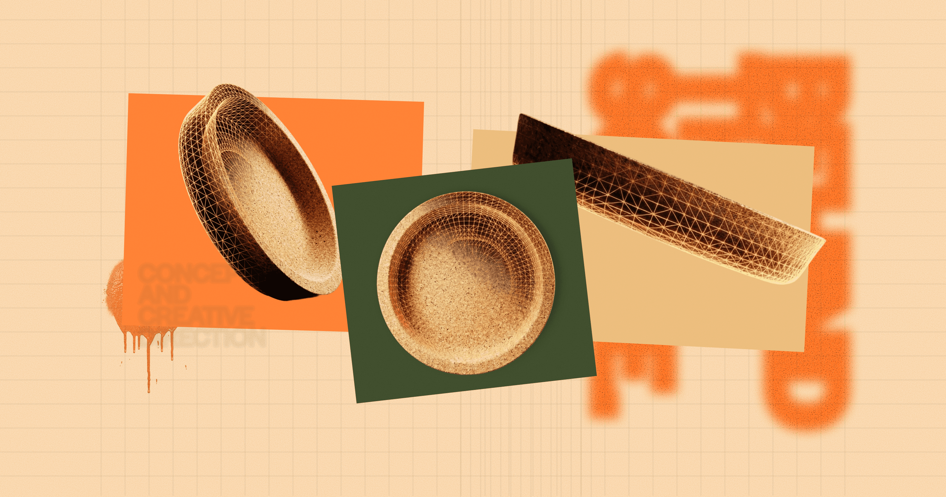
At some point, someone on the team picked up an IKEA cork coaster from his desk and said, what about this?

That was it.
We ran with it, and Oryzo was born.
A Premium Coaster
As you would expect, there are not many features you can realistically sell with a cork coaster.
In the beginning, we genuinely considered abandoning the idea and choosing something else. But after sitting with it for a while, we realised the limitation was actually the opportunity. The product was so mundane that treating it seriously was already funny. That tension became the creative hook.
So instead of moving away from the absurdity, we leaned into it.
We decided to position the coaster as if it were a premium tech product. Something presented with the kind of confidence, polish, and dramatic seriousness you would normally associate with a keynote launch or a high end product page. The gap between what the product actually is and how seriously it is being presented created most of the comedy we needed.
That contrast became the foundation of the project.
Internally, we studied a lot of product storytelling references, particularly the way brands like Apple frame value, intention, and design. Not because we wanted to make a parody of Apple, but because they are still one of the clearest examples of how to turn a product page into a narrative experience.
That influence shaped everything from pacing to framing to the way the product is revealed.
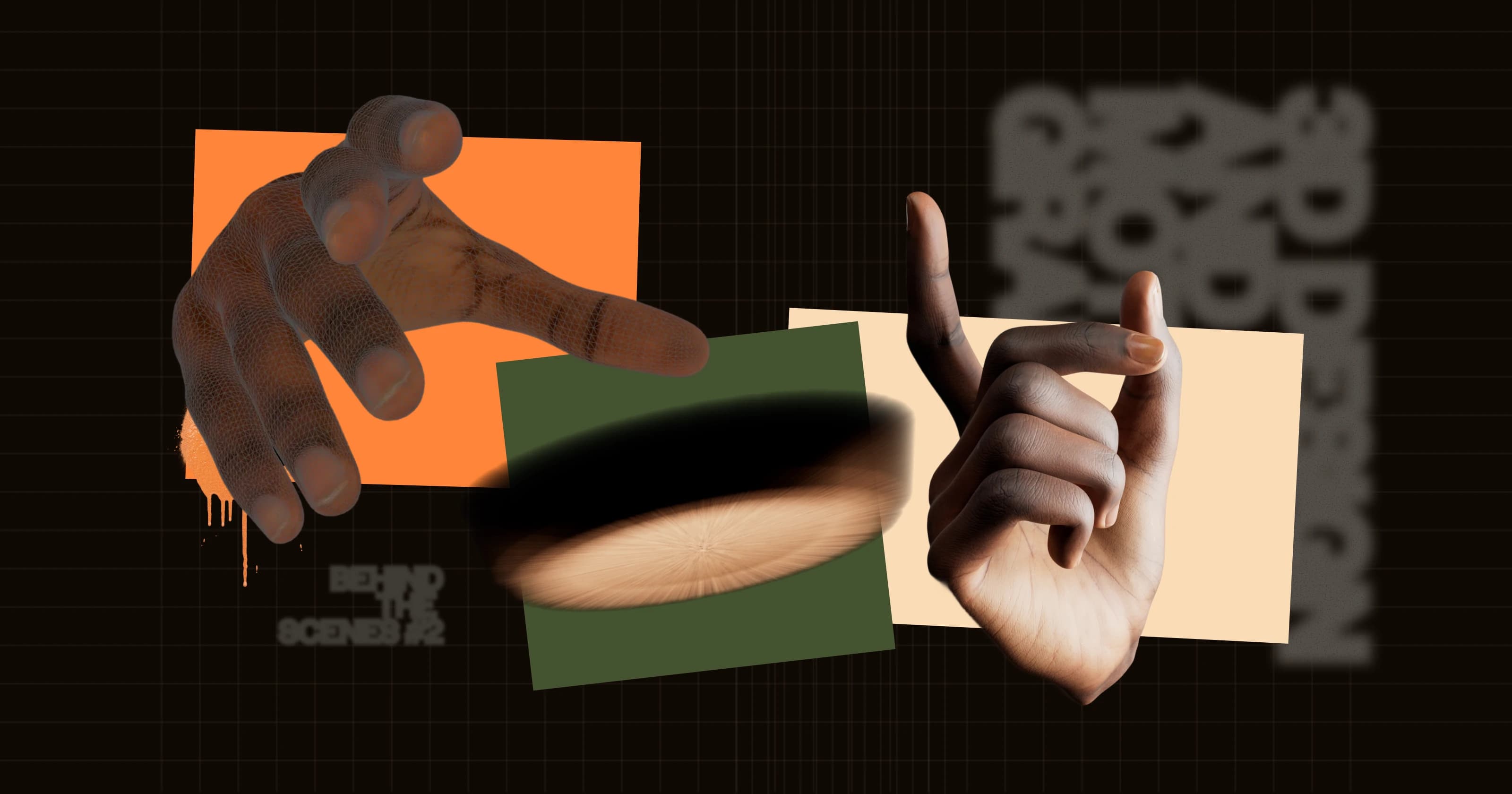
In one section, we took inspiration from Apple’s product storytelling language by using a hand to grab the coaster as part of the title reveal, then followed it with a rainbow like border activation reminiscent of the Action button interface.

This project also forced us to work differently from the kind of immersive websites we usually make.
A premium product page is not built the same way as a spectacle driven experimental site. Normally, we love dramatic motion, big visual moments, and highly performative transitions. But for Oryzo, we had to dial all of that down. The goal was not to overwhelm the user. The goal was to make them look at the product, believe the framing, and feel the brand language around it.
That meant no unnecessary chaos. No huge transformation gimmicks. No random cinematic objects bursting through the screen.
The coaster had to stay at the centre of everything.
Even though the product itself is ridiculous, the experience still needed to feel emotionally convincing. We wanted the site to subtly suggest why this coaster might deserve premium attention, while also making it clear that we were fully aware of the joke.
At the same time, we did not want to make a straight Apple Store clone. Strong visual storytelling is still one of the core things that makes our work feel like Lusion, so the site needed to sit somewhere between premium restraint and immersive theatre.
That balance was surprisingly difficult to get right.
One of the things we learned while crafting our own lusion.co is that visual consistency matters a lot more than individual flashy moments. A beautiful section on its own is not enough. What makes the experience feel premium is when every section feels like it belongs to the same world.
So for Oryzo, we focused heavily on continuity.
We wanted scene transitions to feel as seamless as possible, even when shifting between very different layouts and 3D compositions. That decision made the project significantly harder, especially when dealing with responsiveness and figuring out how to move between scenes without awkward cuts or obvious resets.
But in the end, that effort was worth it. The smoothness of those transitions is one of the reasons the whole thing feels more considered.

AI Satire
We think it's worth stating that we are not against AI.
Like most people working in creative production today, we use AI tools regularly. They are useful for learning, ideation, iteration, and occasionally speeding up parts of the workflow. But at the same time, the internet is now full of low effort AI slop, overhyped product narratives, and a lot of visual nonsense pretending to be innovation.
That made it irresistible material.
If Oryzo was going to pretend to be a premium product for the AI era, then it also needed to borrow some of the visual language and cultural baggage that comes with that territory.
The jokes had to feel specific enough that digital artists, developers, and AI people would immediately recognise them, but still readable enough that a general audience could get the point.
The six finger hand was an obvious one.
It is one of the most iconic visual mistakes from the early Midjourney and Stable Diffusion era, so we took a normal 3D hand model, modified it into a six finger version, and custom rigged it for a playful interaction on the site.

We also generated a yoga instructor character whose head spins all the way around.
Ironically, current image and video models are now much better at preserving human anatomy than they used to be, so getting something convincingly wrong actually took more trial and error than expected. One of the funnier discoveries was that prompting for a 360 degree head spin often does not break the model enough. Asking for 720 degrees gives you much more cursed results.

We also took a shot at wearable AI culture. At some point, every awkward piece of speculative consumer hardware started being introduced as if it would fundamentally change humanity. That was too tempting not to poke at.
So yes, there is a little AI pin joke in there too.

And of course, we could not ignore the endless flood of questionable image generation content on X.
So that made its way into the project as well.

For the AI crowd specifically, we wanted one joke that went a step further than visual gags. That is where Oryzo 1 came from.
If every AI product now needs an open weight model, then obviously our cork coaster needed one too.
So we created an academic style section for Oryzo 1, complete with OBJ model releases, a fake research framing, a model page, a GitHub link, a paper reference, and even a BibTeX block. It is probably the most unnecessarily committed part of the whole project, which is exactly why we liked it.

VC Founder Video
By this point, you can probably tell that we take our jokes far too seriously.
About a week before launch, we had another thought.
If this was going to feel like a real AI product launch, then it should not stop at the website. It also needed the founder video. You know the type. Slightly dramatic. Softly self important. Full of vague problem statements, carefully framed ambition, and just enough restrained confidence to imply that something world changing is happening.
So we made one.
We spent some time studying this genre of video, and the structure is almost always the same:

Once we recognised the format, writing the script became much easier.
The trick was to make it sound legitimate at first, then gradually let the absurdity slip in. We wanted the viewer to feel, for a moment, that this might actually be a real founder video before lines like "removing AI from our AI product" or "zero million dollars in revenue and a zero billion valuation" quietly break the illusion.
To help sell the joke, we also added infographic style motion graphics throughout the video. That layer was important because founder videos often rely on graphics to make very ordinary statements feel meaningful. Used properly, they made the satire land much better.

The production pipeline itself was surprisingly straightforward:
Our ECD, Edan Kwan, recorded the voiceover.
We photographed Edan from a range of static angles.
We used Nano Banana Pro to generate a darker studio style background, because our actual studio is bright and airy, with oak wood flooring that did not really fit the mood we wanted.
We used ElevenLabs Creatify Aurora to combine the audio and still images into a full one minute founder style video. We tested other platforms as well, including Kling, but this gave us the strongest result for what we needed.
After that, we finished everything using a more traditional video workflow: editing, colour grading, animated infographics, and stock audio.
What is funny is that even though the final piece is clearly a joke, a lot of the effort behind it was completely real. That ended up becoming one of the themes of the whole project.
The idea is ridiculous.
The craft is not.
https://www.youtube.com/watch?v=uGJ9qh7DO-0
Closing Thoughts
What started as a simple question, how do we make a physical product website without having a physical product, turned into one of the most enjoyable internal projects we have worked on in a long time.
The cork coaster gave us the perfect canvas because it was so ordinary. It forced us to focus on storytelling, design language, pacing, and tone rather than relying on the product itself to do the heavy lifting. And once we embraced the joke, it opened up even more room to explore the strange overlap between premium branding, immersive web design, and AI satire.
In Part 2, we will go behind the scenes of the 3D design and motion graphics work, and show how we built the premium visual tone that made this ridiculous little product feel strangely believable.
Oryzo Behind-The-Scene Series
We will be publishing the rest of the Oryzo behind the scenes series over the next few days. If you enjoyed this post, feel free to bookmark it or subscribe for the upcoming parts.
☑ Oryzo BTS (Part 1 / 7) - Concept and Creative Direction
☑ Oryzo BTS (Part 2 / 7) - 3D Design and Motion Graphics
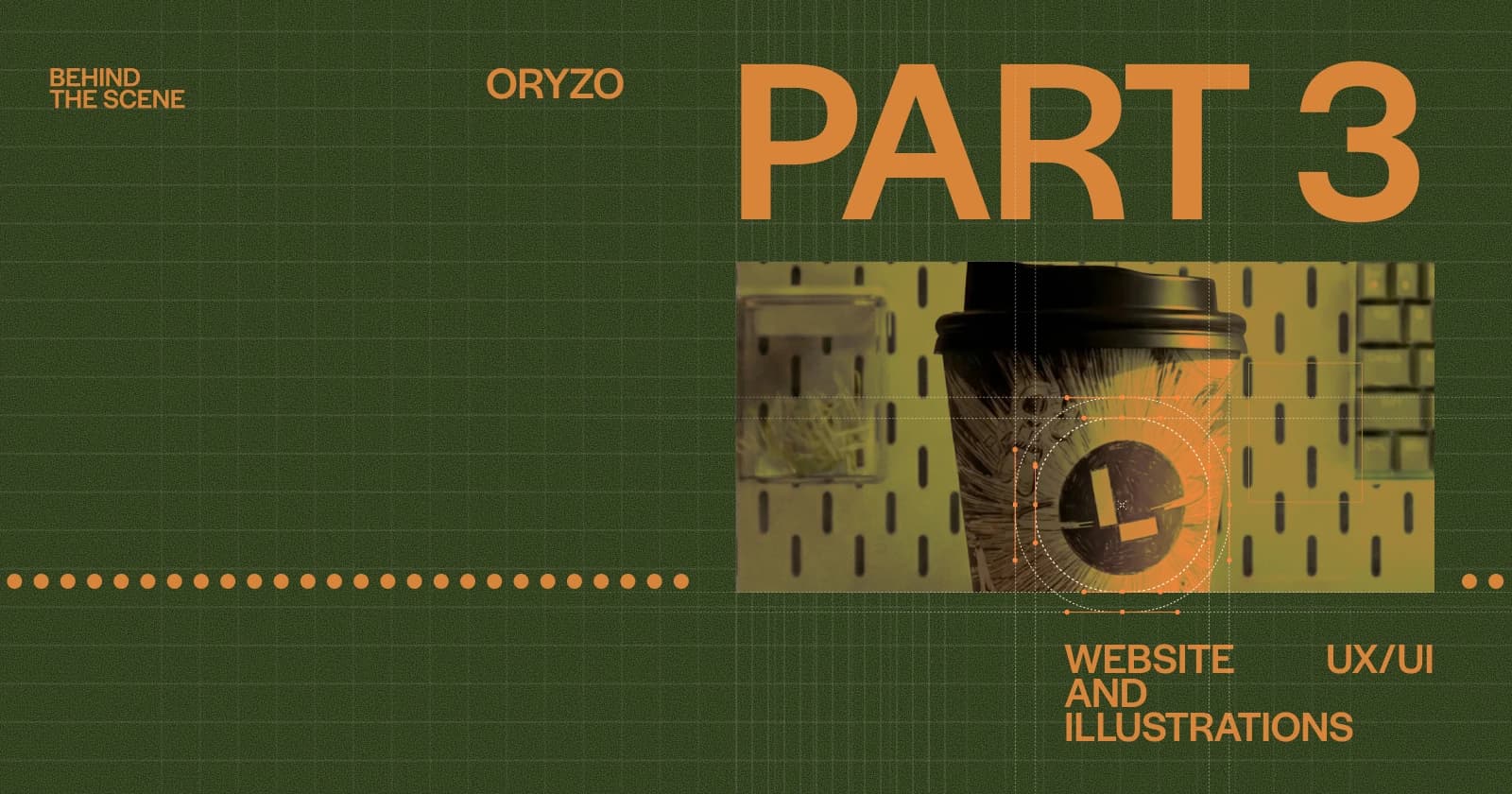
☑ Oryzo BTS (Part 3 / 7) - Website UX/UI and Illustrations
☐ Oryzo BTS (Part 4 / 7) - WebGL/ThreeJS Tricks 1
☐ Oryzo BTS (Part 5 / 7) - WebGL/ThreeJS Tricks 2
☐ Oryzo BTS (Part 6 / 7) - WebGL/ThreeJS Tricks 3
☐ Oryzo BTS (Part 7 / 7) - WebGL/ThreeJS Tricks 4